In the world of fashion, color coordination is key. Certain color combinations can elevate your style, while others might just ruin your entire look. Knowing which colors clash and which ones complement each other can save you from committing unfortunate fashion faux pas.
In this article, we will explore nine of the worst color combinations that you should avoid at all costs. These mismatches are known style saboteurs, and steering clear of them will ensure your outfit choices are always on point.
Dive in to discover how to keep your fashion game strong by avoiding these notorious color pairings.
1. Red and Green
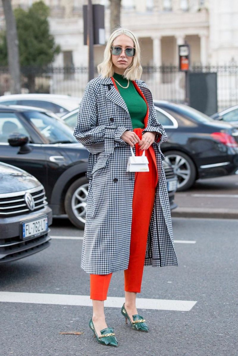
While red and green might remind you of festive holidays, wearing them together in everyday fashion can be a recipe for disaster. These colors are highly contrasting and can create an overly bold look.
Instead of standing out in an appealing way, they may clash in a manner that’s overwhelming. To avoid this, mix red or green with neutral tones, creating a more balanced appearance.
This approach maintains the vibrancy of red or green without the jarring effect of combining the two. Remember, subtlety is key when working with such strong colors.
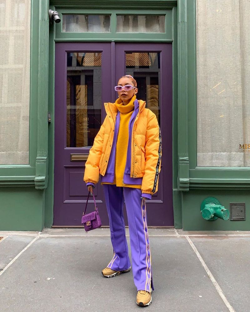
2. Orange and Purple
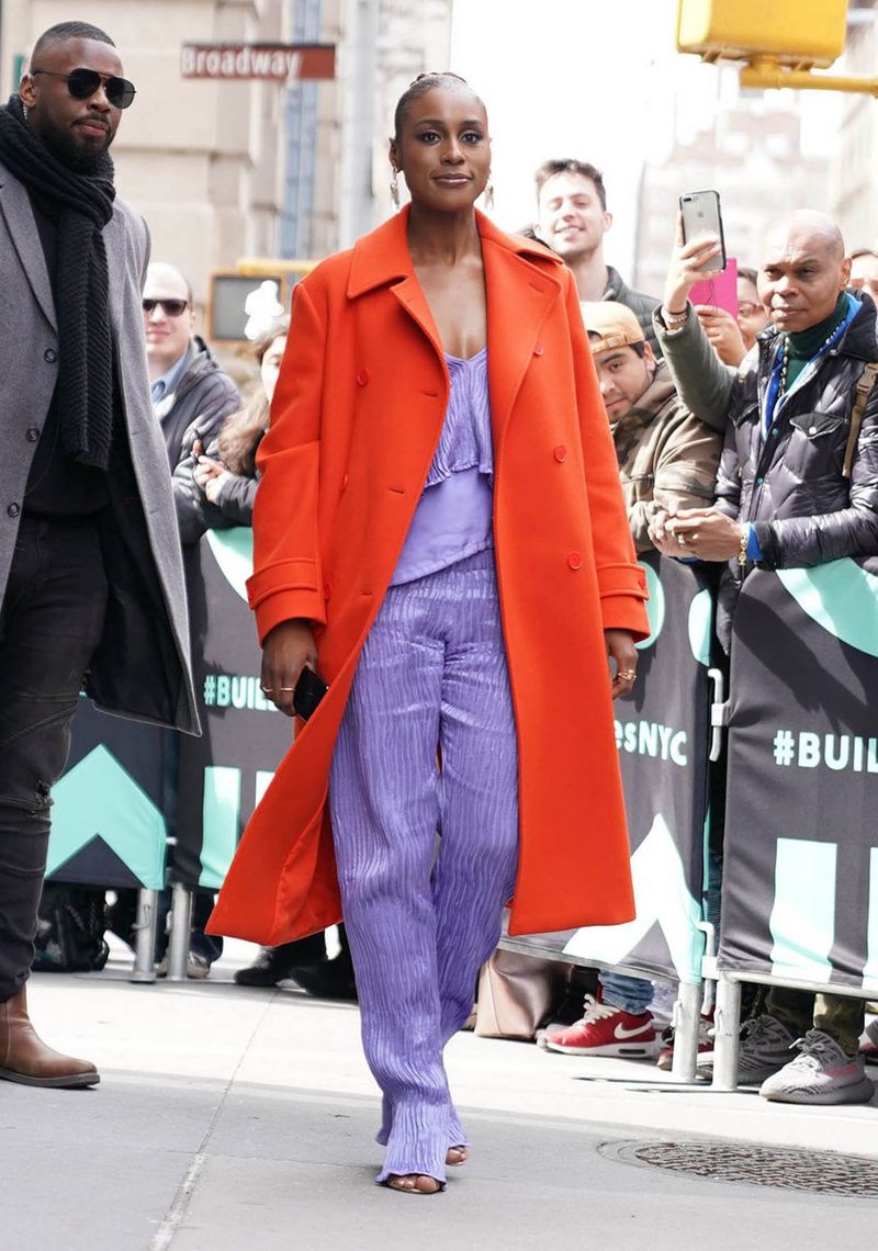
Orange and purple, both striking on their own, can cause visual chaos when paired together. This combination often results in a disjointed look that lacks harmony.
Instead, choose one as an accent and pair it with a softer color to allow its vibrancy to shine. The key is to let one color take the lead while the other plays a supportive role.
This creates a cohesive look that feels both intentional and stylish. By avoiding this clash, you can ensure your style remains sophisticated and polished.
3. Brown and Black
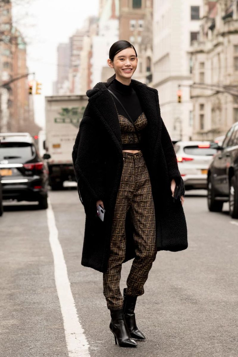
Brown and black are staples in many wardrobes, yet together they can appear muddy and uninspired. These colors are too similar in tone to provide an interesting contrast.
Opt for either color as the foundation of your outfit and complement it with lighter shades. This choice adds depth and dimension, avoiding the dullness that comes from pairing them.
Ultimately, maintaining a clear distinction between these hues ensures your outfit looks intentional, not accidental. This strategic styling tip keeps your look fresh and engaging.
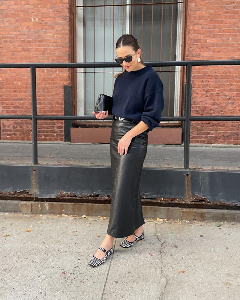
4. Navy and Black
Navy and black can be tricky as they are close in tone, leading to a washed-out appearance. Wearing them together can make your outfit look like a mismatch rather than a stylish statement.
For a more refined look, choose complementary shades like grey or white to break up the monotony. This adds clarity and sophistication to your ensemble.
By being mindful of these subtle differences, you ensure each piece in your outfit enhances the others rather than blending into a dark blur.
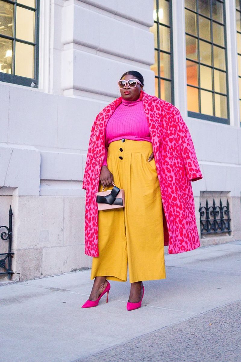
5. Pink and Yellow
At first glance, pink and yellow might seem cheerful, but together they can easily overwhelm the senses. This duo can create a look that’s too bright, making it hard to focus on any one aspect.
To keep the outfit playful yet stylish, try incorporating one of these colors as a highlight against more subdued tones. This maintains the fun spirit without the chaotic clash.
Balancing these lively colors ensures your style is eye-catching for the right reasons, not because the colors are competing for attention.
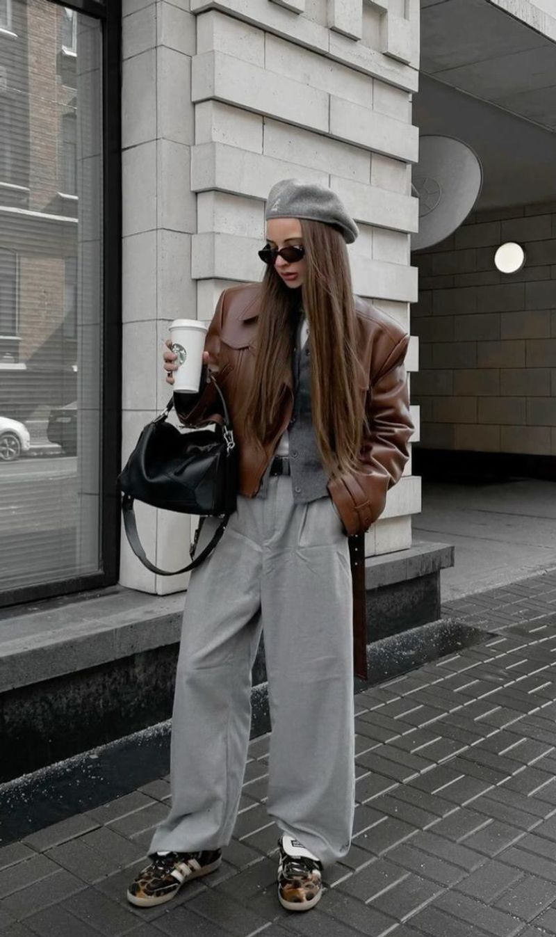
6. Grey and Brown
Grey and brown, both earthy tones, can lack contrast and vibrancy when paired. Together, they might make an outfit look drab and lifeless without a pop of color.
To prevent this, introduce a bold accessory or a bright underlayer to breathe life into the combination. This technique adds an unexpected twist and keeps the overall look dynamic.
With thoughtful additions, grey and brown can be part of a stylish ensemble that feels deliberate rather than lackluster.
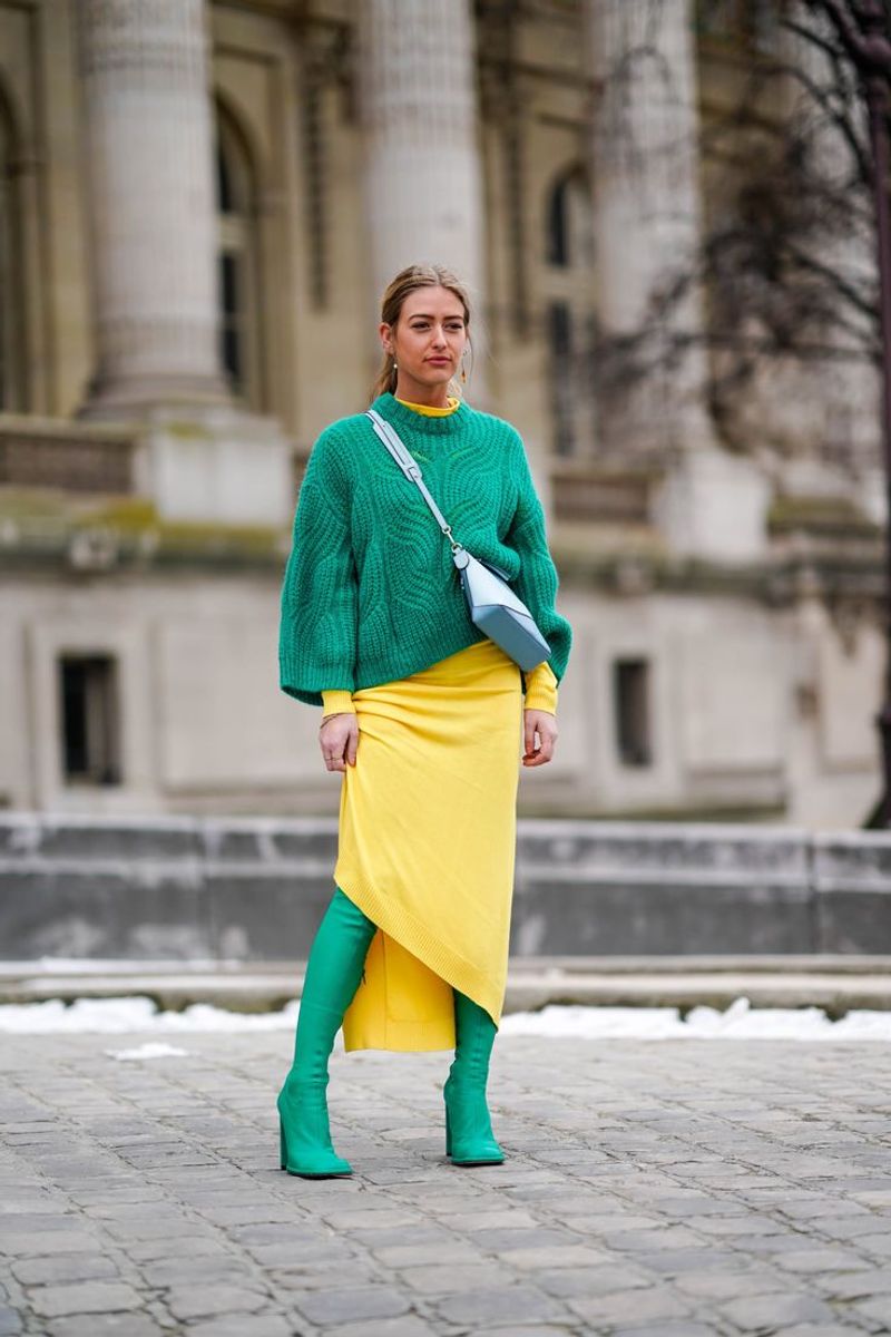
7. Yellow and Green
Yellow and green, though reminiscent of natural settings, can be overpowering in fashion. These bright colors may compete for attention, creating a visual overload.
Instead, use one as the main color and the other as an accent to create harmony and balance in your outfit. This approach ensures that your ensemble remains vibrant without being overwhelming.
Strategically using these colors allows you to channel their energy into a cohesive style statement that’s both striking and stylish.
8. Purple and Yellow
Purple and yellow are complementary colors, but in fashion, they can clash harshly. This pairing often results in a look that’s jarring and lacks subtlety.
To avoid this, use these colors sparingly and with consideration. Opt for pastel shades or incorporate one color as an accessory to soften the impact.
By doing so, you can maintain the vibrancy of purple and yellow without letting them overpower each other, achieving a more balanced and appealing look.
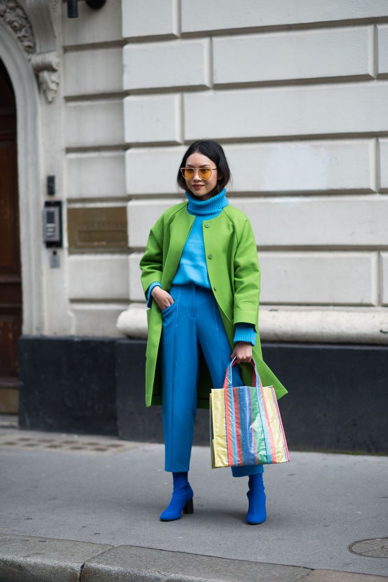
9. Green and Blue
Green and blue, although akin to a natural palette, can blend too seamlessly, lacking the visual interest needed for a standout style. These colors together might appear monotonous.
To enhance contrast, integrate a neutral or metallic accent, creating focal points in your outfit. This technique breaks up the colors and adds dimension.
By thoughtfully combining green and blue, you can transform a potentially flat look into a dynamic and fashionable ensemble that’s sure to turn heads.

